doomfire
Fire animation in pure CSS inspired by the PlayStation version of DOOM.
How This Works
The algorithm for the fire itself is from Fabien Sanglard's How DOOM fire was done. Fabien's write-up was so helpful that it inspired me to try and pay it forward by explaining how my implementation works. So here goes!
Pure CSS
It's quite common for CSS animation demos like these to include a bunch of placeholder HTML elements. Typically it'll be like a bunch of <div> elements for the CSS to animate.
This one doesn't have any of that, which is what I mean when I call it a "pure CSS" implementation. There's no HTML involved except for the bare minimum required to deliver the CSS in a valid way. What this means is that at its very core, the whole animation piggybacks off a pseudo element on the <body> tag.
One square, one frame
We need one static black square as a starting point.
body::after {
  background: black;
  content: "";
  position: absolute;
  width: 128px;
  height: 128px;
}

::after pseudo-element.The black square is the ::after pseudo-element.
Two squares, one frame
The next step is to turn that 1x1 black square into a whole 2D screen, and the magic words for that is box-shadow. In most everyday web development, box shadows are blurry and obscured by the element they belong to. To use them for this kind of magic, there are three rules:
- Hide the element itself: no background color.
- Position them so that they're completely outside the element.
- Don't set a blur radius.
So here's an updated example using the above technique to increase the resolution from 1x1 to 1x2.
body::after {
  content: "";
  position: absolute;
  width: 128px;
  height: 128px;
  box-shadow:
    128px calc(128px * 0) yellow,
    128px calc(128px * 1) red;
}
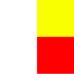
box-shadow and the red square is drawn by the second one.The yellow square is drawn by the first box-shadow and the red square is drawn by the second one.
Two squares, three frames
From here, increasing the resolution beyond 1x2 is a matter of adding more box shadows to the list. And making them update to look like a fire is a keyframe animation.
@keyframes fire {
  33% {
    box-shadow:
      128px calc(128px * 0) white,
      128px calc(128px * 1) white;
  }
  66% {
    box-shadow:
      128px calc(128px * 0) white,
      128px calc(128px * 1) red;
  }
  99% {
    box-shadow:
      128px calc(128px * 0) yellow,
      128px calc(128px * 1) red;
  }
}
::after pseudo-element.Now it's starting to look like a fire.
Performance trade-offs
One of the downsides of this technique is how inefficient it is. Box shadows don't animate efficiently even at small scale and this takes them to an extreme. On the bright side, the heating effect this fire animation has on your CPU adds an extra level of immersion and realism to the experience.
And because every pixel in every frame of the animation needs to be declared explicitly, this is a bandwidth hog too. This 16 second animation is 3.5 megabytes of CSS! Rather than have it cut out abruptly after 16 seconds, I've made it loop infinitely. And fortunately enough, the loop is really seamless. But to make it loop, I've had to cut the part at the beginning where the fire spreads in from the bottom, which is a shame.
It's not all downsides though. The original DOOM implementation has a real videogame look to it, and the reason this implementation looks a bit more like real flames is thanks to CSS. While the example code above uses a square pseudo element, the real animation uses a long thin one. This stretches the flames out a bit vertically, without changing anything about the algorithm powering it. Combined with the blur filter, I think it produces a pretty neat effect!